Online courses on data preparation, analysis and visualization
This is a library of videos and other training resources that aim to:
- Explain the processes of data preparation, integration, and exploration, with guidelines and suggested practices.
- Solve real-world cases and discuss the solutions found.
- Demonstrate the use of tools in performing concrete tasks.
Guidelines and suggested practices
- These are long courses (one hour or more);
- Their goal is to communicate the basics of data preparation, structure and display;
In these courses you will find in-depth explanations of how visual perception, color theory, or the questions we ask should shape the choice and design of graphics; how data should be prepared and structured; or how to efficiently design an Excel file (there’s more to say than meets the eye).
Online course on data visualization

The first of these courses, Introduction to Data Visualization, shows how office users without graphic design skills can apply these principles and best practices.
This online data visualization course is designed for office users who need to improve their business data visualization skills using familiar tools such as Excel spreadsheets and business intelligence applications.
How-to videos

- They are short videos of up to 10 minutes;
- They focus on performing a task, such as making a chart or transforming a data table.
These videos are strictly about “how to” use familiar tools (Excel, PowerQuery, PowerBI). Data tends to be fictitious or irrelevant in content.
How to make charts in Excel
I often get feedback like, “I didn’t know you could do this in Excel.”
Making more complex charts involves figuring out what resources we have available and how they can be used in a less obvious way. But often, the difficulty in making them is not their technical complexity: it is to know how to apply good data visualization guidelines. Many of the charts in the collection fall into this category.
Click a chart below to go directly to its page.
The collection will increase. Contact me if you want to suggest any type of chart.
![[Excel] How to make a pie chart](/assets/images/img_video/excel/col-excel-pie.png)
![[Excel] How to make a filled doughnut chart](/assets/images/img_video/excel/col-excel-filled-doughnut.png)
![[Excel] How to make a hemicycle plot](/assets/images/img_video/excel/col-excel-hemicycle.png)
![[Excel] How to make a doughnut chart with emphasized slice](/assets/images/img_video/excel/col-excel-doughnut-emphasis.png)
![[Excel] How to make a doughnut chart](/assets/images/img_video/excel/col-excel-doughnut.png)
![[Excel] How to make a 100% stacked bar chart](/assets/images/img_video/excel/col-excel-100-stacked-bar.png)
![[Excel] How to make a bowtie plot](/assets/images/img_video/excel/col-excel-bowtie-plot.png)
![[Excel] How to make a vertical range dotplot with average](/assets/images/img_video/excel/col-excel-dotplot-range-average.png)
![[Excel] How to make a range dot plot](/assets/images/img_video/excel/col-excel-dotplot-range.png)
![[Excel] How to make a vertical range dotplot](/assets/images/img_video/excel/col-excel-dotplot-range-vertical.png)
![[Excel] How to make a slope chart](/assets/images/img_video/excel/col-excel-slope-chart.png)
![[Excel] How to make a simple bubble strip](/assets/images/img_video/excel/col-excel-bubble-strip-plot.png)
![[Excel] How to make a vertical strip plot](/assets/images/img_video/excel/col-excel-vertical-strip-plot.png)
![[Excel] How to make a bullet chart](/assets/images/img_video/excel/col-excel-bullet.png)
![[Excel] How to make a simple gauge](/assets/images/img_video/excel/col-excel-gauge.png)
![[Excel] How to make a vertical lollipop](/assets/images/img_video/excel/col-excel-lollipop-vertical.png)
![[Excel] How to make a bar chart with two series](/assets/images/img_video/excel/col-excel-bar-2-series.png)
![[Excel] How to make a simple bar chart](/assets/images/img_video/excel/col-excel-bar-simple.png)
![[Excel] How to make a bar chart with a reference marker](/assets/images/img_video/excel/col-excel-bar-reference-marker.png)
![[Excel] How to make a bar chart with a reference line](/assets/images/img_video/excel/col-excel-bar-reference-line.png)
![[Excel] How to make a Pareto chart](/assets/images/img_video/excel/col-excel-pareto.png)
![[Excel] How to make a bar chart with overlapping series](/assets/images/img_video/excel/col-excel-bar-overlapping.png)
![[Excel] How to make a simple lollipop](/assets/images/img_video/excel/col-excel-lollipop-simple.png)
![[Excel] How to make a Likert scale chart](/assets/images/img_video/excel/col-excel-likert-scale.png)
![[Excel] How to make a bar chart with labels inside](/assets/images/img_video/excel/col-excel-bar-labels-inside.png)
![[Excel] How to make a simple dotplot](/assets/images/img_video/excel/col-excel-dotplot-simple.png)
![[Excel] How to make a dot plot with arrows](/assets/images/img_video/excel/col-excel-dotplot-arrow.png)
![[Excel] How to make a bar chart with negative values](/assets/images/img_video/excel/col-excel-bar-negative.png)
![[Excel] How to make a population pyramid with bar charts](/assets/images/img_video/excel/col-excel-bar-pyramid.png)
![[Excel] How to make a line pyramid](/assets/images/img_video/excel/col-excel-line-pyramid.png)
![[Excel] How to make an area chart pyramid](/assets/images/img_video/excel/col-excel-pyramid-area.png)
![[Excel] How to make a dotplot with positive and negative values](/assets/images/img_video/excel/col-excel-dotplot-negative-values.png)
![[Excel] How to make a bubble chart](/assets/images/img_video/excel/col-excel-bubble.png)
![[Excel] How to make a bubble heatmap](/assets/images/img_video/excel/col-excel-bubble-heatmap.png)
![[Excel] How to make a connected scatterplot](/assets/images/img_video/excel/col-excel-connected-scatterplot.png)
![[Excel] How to make a scatterplot with marginal frequencies](/assets/images/img_video/excel/col-excel-scatterplot-frequencies.png)
![[Excel] How to make a simple scatterplot](/assets/images/img_video/excel/col-excel-scatterplot-simple.png)
![[Excel] How to make a split scatterplot](/assets/images/img_video/excel/col-excel-split-scatterplot.png)
![[Excel] How to make an area chart](/assets/images/img_video/excel/col-excel-area.png)
![[Excel] How to make a line chart with a horizontal highlight](/assets/images/img_video/excel/col-excel-lines-horizontal-highlight.png)
![[Excel] How to make a line chart with custom markers](/assets/images/img_video/excel/col-excel-line-chart-markers.png)
![[Excel] How to make a tensile line chart](/assets/images/img_video/excel/col-excel-line-chart-tensile.png)
![[Excel] How to make a line chart with vertical highlight](/assets/images/img_video/excel/col-excel-line-chart-vertical-highlight.png)
![[Excel] How to make a line chart with xl markers](/assets/images/img_video/excel/col-excel-line-xl-markers.png)
![[Excel] How to make a simple line chart](/assets/images/img_video/excel/col-excel-line-simple.png)
![[Excel] How to make a step chart](/assets/images/img_video/excel/col-excel-step.png)
Tools
- Always keep in mind that most data visualization and data processing skills are transferable (not tool- or data- dependent);
- Right now, most charting courses use Excel; it is intended to have more videos about PowerBI , PowerQuery, or even other tools.
- Be curious about how each tool implements a technique or graph.
Many of the skills in data processing and representation are transferable. Apply them using the tool of your choice, from paper and pencil to a program or programming language. Each application implements processes and visuals differently, and you need to adapt to that, but the fundamental ideas don’t change. Since there aren’t many types of questions a chart can answer (rankings, proportions, evolution, relationships), trying a few should be enough to understand the basic mechanics of producing charts and tables in each application.
Excel is the most common tool for making graphs and is over-represented in the video collection. Gradually, more charts will become available in PowerBI or other tools, including Tableau. Also online tools like Flourish or Datawrapper, two great applications with a visualization perspective that is a balm after using Microsoft tools. In the data preparation component, most of the videos will be about using PowerQuery.
Don’t ignore tools that aren’t relevant to you. Notice how each one implements the visualization concept for each chart. Some allow you to group segments in a pie chart; others force you to choose the color for dozens of series manually, while others automate the process. The list could go on and on. What is important to emphasize is that when you move from one tool to another, something is always gained and lost, and noticing these differences is enlightning.
How to use the videos
- Use the sidebar to browse the collection;
- On each page, there is an introductory text that explains the content.
- Try to follow the tool tutorials by following the steps presented;
- Some of the videos have narration in English, with Portuguese subtitles.
In the case of videos focused on guidelines and suggested practices, what is essential is to understand the rationale in the entire data manipulation process, from collection to representation. This will facilitate the introduction of these suggestions into current practice.
Charts applied to real cases will be available. These examples are mainly intended to show the process when applied to concrete cases, using public datasets. I suggest you watch the video once to get a general idea and review it again, but this time replicating the steps.
The short videos on how to perform a task can be used on a case-by-case basis, which is their primary purpose. But it’s helpful to analyze several and see how specific and less obvious techniques are used repeatedly. Error bars, for example, allow you to make various types of graphs that Excel does not support by default.
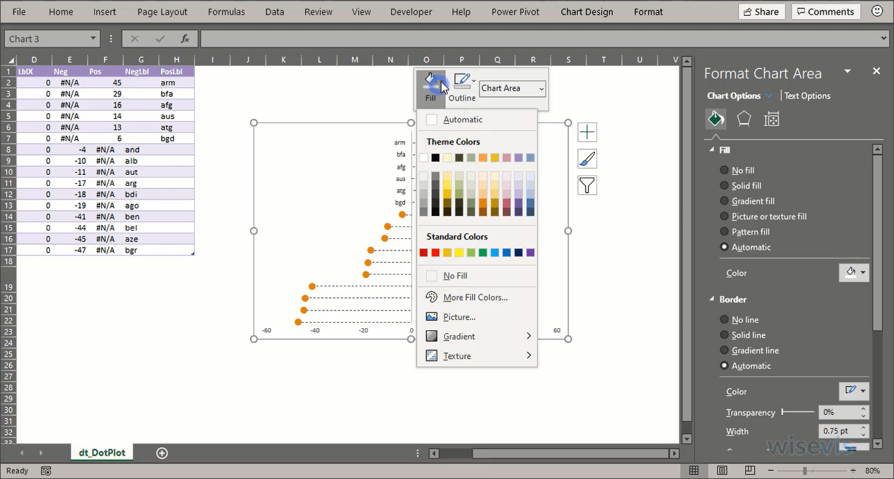
These charts use fictitious data that can be entered by hand or by generating some random numbers. Watch the entire video once, then replay the steps, using a slower playback speed or pausing the video as needed. In the video, a blue ring means a left-click click, and a red ring means a right-click. The last section on the video page includes notes that clarify some points, if necessary.
Note that short videos are published without narration, but their page contains some explanatory notes. Subtitles and narration will be added if necessary (send feedback).
Subscribe to the collection
All videos with restricted access are available in a single collection, which can be subscribed to monthly.
We aim to make the collection dynamic, improving current videos and adding new ones on a regular basis. The choice of new content depends a lot on feedback ( Twitter and LinkedIn , email jorge.camoes at wisevis.com), so comments, suggestions and criticism are very welcome.
