
Automate
Collect and prepare your data, knowing thatit will always be clean, tidy and up-to-date, ready to support analysis and decision-making.

Connect
Reduce error and minimize risk when in using spreadsheets. Organize and get an integrated view of your customer data, market, sales force and more.

Discover
Make effective charts, dashboards, reports and presentations, assess sales force performance, define and access KPIs wherever you are.
My services

Consulting
Do you Want to know if you’re getting the most out of your data? Does data preparation take longer than expected? Are your charts effective? Want to design a dashboard? These are some cases where I can help.

Training
Need a half-day presentation focused on data handling principles and best practices? Or maybe a two-day hands-on workshop on using the tools? See some of the possibilities or design a bespoke formation with me.

Video courses
A growing collection of videos covering the various topics of data handling in Excel, PowerQuery and PowerBI. They can be used independently or as a support and complement to training actions.
My book
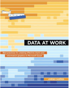
My book Data at Work, shows how office users (that is, without graphic design knowledge) can apply information visualization theory to their daily lives, creating efficient and elegant graphics. Not being a book about making charts in Excel, I ensured that all charts published in the book could be made in Excel.
The book creates a safety net that helps non-designers choose and justify design options that emphasize the functional role of graphics: How does visual perception influence graphic design? Which charts are the best answer to the questions we ask of data? How to use color effectively and not just as a choice of aesthetics and personal taste?
Featured chart: Mortality in Portugal
Mortality in Portugal is higher in winter than in summer. In this chart, each stripe represents each day of the year. We can see the impact of the flu period at the beginning and end of the year. Reddish periods in the middle of the year correspond to heatwaves. In January 2021, Portugal experienced the most significant increase in mortality since 2009 due to the Covid-19 pandemic.
Open interactive chart
