![[Excel] How to make a Likert scale chart](/assets/images/img_video/video-tutorials-header.png)
[Excel] How to make a Likert scale chart
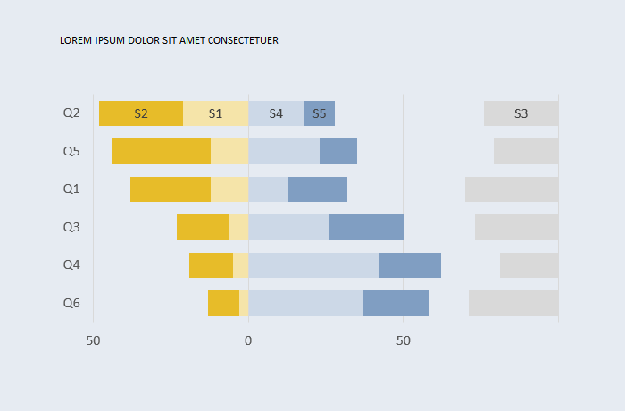
A Likert scale splitting positive and negative rates, with neutral rates on the side.
Design notes
- A Likert scale typically ranges from highly negative to highly positive, with a neutral class.
- You can display results using a regular stacked bar chart, but displaying negative values to the left and positive to the right is usually more interesting.
- The neutral class can be split in two (half negative, half positive) and displayed at the center or can be removed and displayed on the side.
Video
Notes
- 00:30: Insert the actual columns that will be displayed. It’s simpler to order these columns as they will be displayed on the chart.
- 00:50: The Dummy series subtracts series 3, 4 and 5 from 100.
- 03:19: Repeated step: add the remaining labels.