![[Excel] How to make a dotplot with positive and negative values](/assets/images/img_video/video-tutorials-header.png)
[Excel] How to make a dotplot with positive and negative values
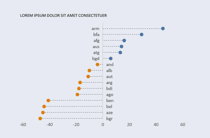
This dotplot easily manages changes in the data (positive and negative values, sort order) while keeping labels close to the axis.
Design notes
- This is based on a scatterplot, where your data is displayed along the x-axis and the y values are generated by ranking the x values.
- Category labels are placed along and close to the y axis, that’s why [LblX] is added.
- Columns [Neg] and [Pos] are used to split column [X] into positive and negative values.
- Columns [NegLbl] and [PosLbl] do the same for the [Label] column.