[Excel] How to make a 100% stacked bar chart
Video tutorial on how to make a 100% stacked bar chart in Excel
 Video tutorials
Pie, doughnut, and stacked bar charts answer part-of-a-whole questions. They are a step above KPIs on a complexity scale, but they serve essentially the same purpose: communicating a basic message to be used as a reference or anchor point. Use them in conjunction with other charts that provide further detail.
Some authors (for example, Stephen Few) will tell you that you should avoid pie charts and everything circular because humans are less than perfect at comparing slices. They will also tell you that you should use just a few slices if you’re using them. As a result, switch to bar charts and avoid pies as much as possible.
I believe there is a more balanced approach. If you’re switching from pie to bar charts, you are not switching the visual type only. You are changing the question. A bar chart is not a more perceptually accurate pie chart. It allows you to compare and rank values, but you lose the whole: it’s hard to tell that the first bar accounts for 19% of the total (without reading the label) or that the first three bars account for more than 50% of the whole, something that is easy with a pie chart. Also, accuracy is useful but not essential. If “around a third” is good enough, the difference between 30% and 35% may not be relevant, given the context.
The number of slices also needs a less literal interpretation. You can have six or seven and a confusing message, and you can have 50 and a clear message. What matters is how you sort and group slices to create layers of relevance.
You should keep in mind that it will always be information-poor, no matter how stylized a circular chart is. Use it as a gateway to more nutritious visuals.
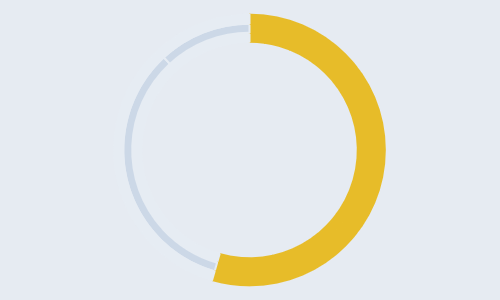
Doughnut charts were first “sold” as something similar to pie charts but with the advantage of displaying and allowing to compare more than one series. This practice has a lot of issues, and fortunately, it’s not popular anymore. Today, a popular design is to emphasize a single slice using a combination of color and thickness.
Use stacked bar charts carefully:
The bow tie chart falls under the category of fun charts. I designed it (or at least I was not aware of other examples before) to display “mirror categories” like capital expenses and capital revenue in a budget.
Video tutorial on how to make a 100% stacked bar chart in Excel
Video tutorial on how to make a bowtie plot in Excel
Video tutorial on how to make a doughnut emphasizing a slice in Excel
Video tutorial on how to make a doughnut in Excel
Video tutorial on how to make a filled doughnut in Excel
Video tutorial on how to make a hemicycle plot in Excel
Video tutorial on how to make a pie chart in Excel