![[Excel] How to make a doughnut chart with emphasized slice](/assets/images/img_video/video-tutorials-header.png)
[Excel] How to make a doughnut chart with emphasized slice
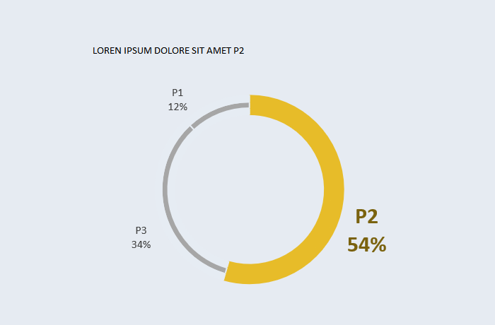
Judging by the innumerable phone apps that use them, there is no cooler chart than a thin doughnut with an emphasized slice.
Design notes
- A thin doughnut with a thicker slice for emphasis is currently one of the most popular designs.
- There can be more than two slices, but only one is emphasized.
- Evaluating proportions in doughnut charts is harder than in pie charts, so meaningful values should be labeled.
- Add the series three times
- Use gray to fill all slices
- Apply a color to the emphasized slice (fill and outline) in all three series
- For the remaining slices, use white (or the background color) for fill and outline in the first and the last series.
- Keep the middle series fill gray, and use white for outline.
Video
Notes
- 01:02: repeated step: set all series to gray fill and outline.
- 01:22: repeated step: choose a color to emphaise a slice and set fill and gray to that color in all series.
- 01:45: repeated step: set all other slices to the background color, except the series in the center, which should also the the outlines set to the background color.