![[Excel] How to make a split scatterplot](/assets/images/img_video/video-tutorials-header.png)
[Excel] How to make a split scatterplot
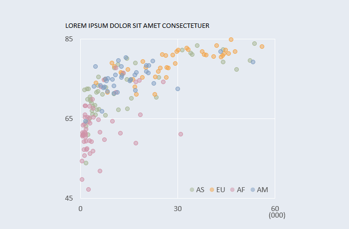
Use a splitting categorical variable to find clusters of homogeneous data points.
Design notes
- Check the aspect ratio.
- Reduce opacity to avoid occlusion (overlapping data points).
- Don’t split by category if there are no obvious differences between categories. Import several categorical variables and test which ones create more homogenous groups.
- Usually, all categories should share the same format (fill transparency, border width) but you may want to emphasize one of them using larger markers and/or more saturated colors.
Video
Notes
Real-world example
00:05: You need to split the “master” x,y variables by each of the categories, so for category AS, you’ll need columns AS_x and AS_y
00:20: repeated steps: create two new x,y columns for each category
00:35: Add only the new columns to the chart, not the “master”ones
00:45: repeated steps: add tall categories
02:11: repeated step: change formatting options for each category