![[Excel] How to make a Pareto chart](/assets/images/img_video/video-tutorials-header.png)
[Excel] How to make a Pareto chart
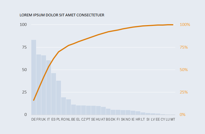
The Pareto chart is a solid third alternative to bar and pie charts when displaying proportions.
Design notes
- The advice to use bar charts instead of pie charts is most common in data visualization. It should be used when comparing categories is more relevant than conveying the notion of part-of-a-whole.
- The Pareto chart combines the comparison of categories with their cumulative proportion. It is an interesting alternative to add a sense of proportions, but it doesn’t’ give you a sense of individual proportions.
- This chart is one of the few examples where you can safely use a secondary axis, but make sure the audience knows which series are associated with which axes.
- You may want to add markers indicating 80% or other cumulative values.
Video
Notes
-
00:20: After sorting values in descending order, calculate their cumulative percentage using the formula:
=SUM(tblData[[#Headers],[Value]]:[@Value])/tblData[[#Totals],[Value]]‘It reads: calculate the cumulative value so far and divide by the total value.’