![[Excel] How to make a slope chart](/assets/images/img_video/video-tutorials-header.png)
[Excel] How to make a slope chart
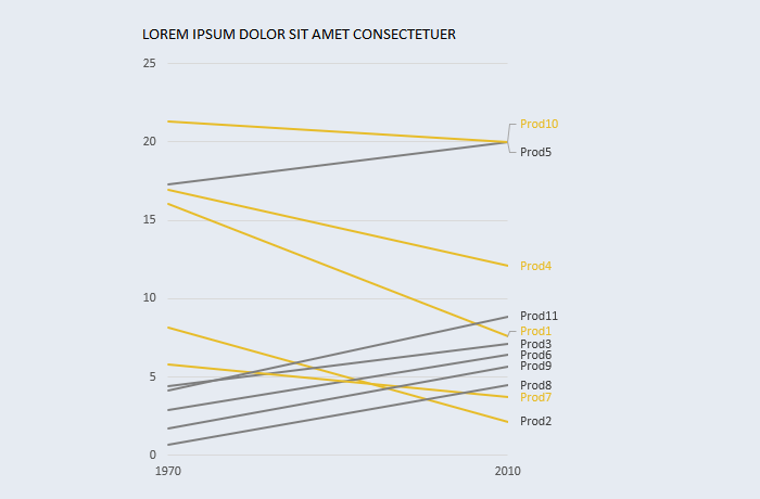
Slope charts allow for an effective way of comparing multiple categories.
Design notes
- Slope charts should not be read as a line chart with only two periods: they can be used to represent variation between two states (time, space, etc.). In this chart type, does not imply continuous variation.
- They can replace 2-series bar charts, making pairwise comparisons clearer and allowing for log scales on the y-axis, which means that you can use it to analyze rates of change.
Video
Notes
01:17: repeated step: change the outline color of each series.