[Excel] How to make a simple gauge
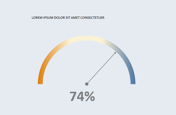
A gauge with three states in a continuous scale. Useful for displaying simple KPIs in dashboards where screen real estate allows it.

Design notes
- To create a gauge you need to transform your data points to polar coordinates using basic trigonometry.
- For a pointer, you also need a center and a radius.
- Use a scatterplot for x,y values.
- You need two new data points to create a continuous scale, or more, if you want to display classes.
- Set the lower slice to no fill to hide it and a gradient fill in the upper slice.
- Orange/blue are a safe bet for diverging colors. Check if the pair you chose is color blindness safe.
- The KPI value is usually displayed, as a label or below the chart.
Video
Notes
-
00:25: Formula for the X column:
=COS(PI()*tblData[KPI])*Table7[Radius] -
00:38: Formula for the Y:
=SIN(PI()*tblData[KPI])*Table7[Radius] -
00:50: Select a scatterplot for the pointer.
-
01:35: Try to make the chart square.
-
01:50: You add the scale as a scatterplot, but that’s an intermediate step. After changing it to doughnut you nee to define the ranges again.
-
02:30: Invert the x-axis so that zero is on the left and 100% is on the right.
![[Excel] How to make a simple gauge](/assets/images/img_video/video-tutorials-header.png)