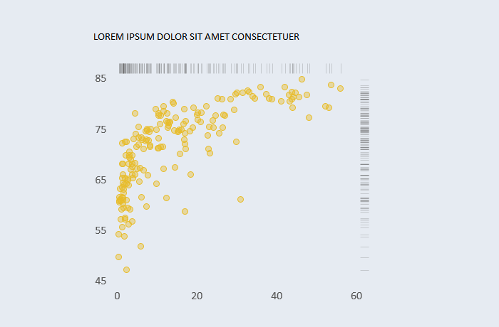
[Excel] How to make a scatterplot with marginal frequencies
Visualizing the distribution of individual variables along the axes can add interesting insights to the scatterplot.

Design notes
- Add the x and y variables.
- You can display frequencies along the axis or on the opposite side (top for the x axis, right for the y-axis).
- Add the x again with the fixed y value and the y value with the fixed x value.
- Check the aspect ratio.
- Increase transparency to avoid occlusion (larger bubbles hiding smaller ones).
- This also applies to marginals frequencies.
- Show dot outline using a darker color.
![[Excel] How to make a scatterplot with marginal frequencies](/assets/images/img_video/video-tutorials-header.png)