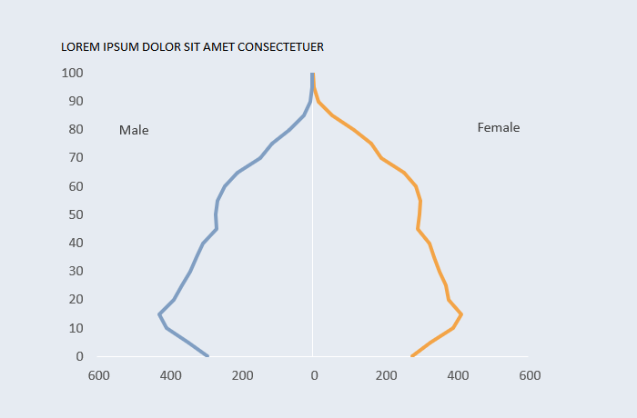
[Excel] How to make a line pyramid
Using lines to create population pyramids creates lighter and clearer charts and allows for more comparisons.

Design notes
- Use a connected scatterplot where age is a numerical value defined by age in single-year classes or the minimum age for each class in 5-year classes.
- Displaying Male to the left requires multiplying values by -1 and hiding the minus sign from the x-axis labels.
Video
Notes
- 00:38: Add a new column to create a numerical value to use along the y-axis using the formula:
=IF([@AgeGroup]="100+",100,VALUE(LEFT([@AgeGroup],2)))It reads: get the first to positions from the [AgeGroup] value and turn them into a numeric value; if the value in [AgeGroup] is “100+” use 100.
- 00:25: Multiply [Male] by -1 so that the series is displayed on the left.
![[Excel] How to make a line pyramid](/assets/images/img_video/video-tutorials-header.png)