![[Excel] How to make a line chart with vertical highlight](/assets/images/img_video/video-tutorials-header.png)
[Excel] How to make a line chart with vertical highlight
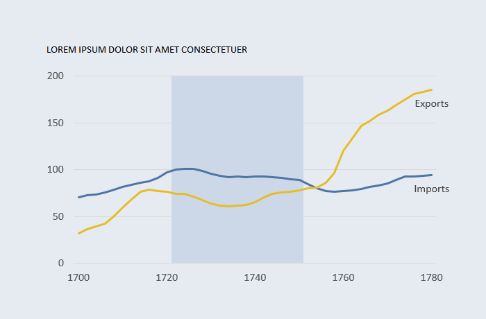
Highlighting a period can help understand the context and how the series reacted.
Design notes
- Associating the dummy series with the secondary y-axis is the easiest way to create the highlighted range. Define the scale between zero and one.
- Use a neutral color to the highlighted range, since it should complement, not distract, from the data series.
Video
Notes
00:05: Formula to define a range:
=IF(AND([@Year]>1720,[@Year]<=1750),1,NA())