![[Excel] How to make a tensile line chart](/assets/images/img_video/video-tutorials-header.png)
[Excel] How to make a tensile line chart
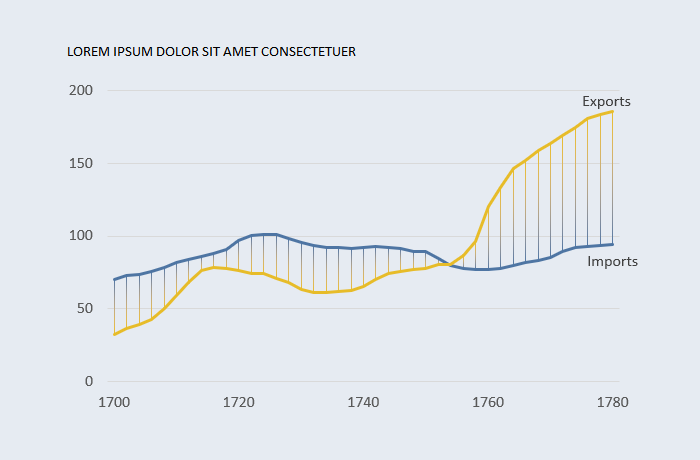
You can’t fill the area between series in a line chart, but it’s possible to achieve a similar effect using error bars.
Design notes
- The error bars are colored with a gradient that replicates color encoding used for the series. A more neutral option could be used.
- Since it’s a gradient between two colors, you can remove the intermediate steps.
Video
Notes
-
The error bars are calculated subtracting one series from the other. When imports are higher than exports this formula was used:
=IF([@Imports]>=[@Exports],[@Imports]-[@Exports],NA()) -
When exports are higher than imports:
=IF([@Exports]>[@Imports],[@Exports]-[@Imports],NA())
###