![[Excel] How to make a line chart with a horizontal highlight](/assets/images/img_video/video-tutorials-header.png)
[Excel] How to make a line chart with a horizontal highlight
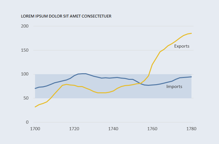
Horizontal highlights help identifying periods outside an expected band of variation.
Design notes
- In this example minimum and maximum values are hardcoded, but you can use formulas to create dynamic bands based on the data, dates or external parameters.
- If you use overlapping areas the first series must be white (or background color) to simulate the band above. You also have to define the maximum value.
- Stacked areas look better, because the bottom one can be fully transparent (no fill), so the gridlines remain visible. The maximum value is defined by band width.