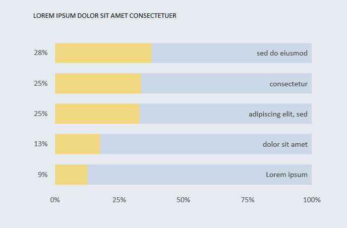
[Excel] How to make a bar chart with labels inside
A different way of moving category labels to the plot area and displaying values instead.

Design notes
- One of the reasons why horizontal bar charts could be chosen instead of vertical bars is that category labels can have more text. However, lengthy labels often reduce the width of the plot area. Moving them to the plot area if a good alternative.
- Moving the category labels frees up some space that can be used to add labels displaying the numeric values.
- You need a a dummy series that calculates the difference between the top of the scale and each categorical value.
![[Excel] How to make a bar chart with labels inside](/assets/images/img_video/video-tutorials-header.png)