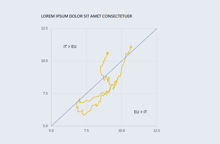
[Excel] How to make a connected scatterplot
A scatterplot allows you to see how the relationship between two variables changed over time, and it’s one of the best chart types ever (needs a bit of learning, though).

Design notes
- Connected scatterplots are hard to read. If your audience is not familiar with them annotate profusely so that each change in direction and pace can be understood.
- Make it clear where the time series begins and where it ends.
- If there is too much noise try to simplify the shape using moving averages or other noise reduction techniques.
- Use a diagonal line for a simpler more-than/less-than (example: if comparing men and women’s wages, with women along the y-axis, data points above the diagonal means that women earn more.)
![[Excel] How to make a connected scatterplot](/assets/images/img_video/video-tutorials-header.png)