
Making charts with Datawrapper
Datawrapper allows you to create and share charts online. If you don’t need an overly complicated chart with multiple geometries, this is a great tool. Each chart type includes several useful options and well-thought-out defaults, ensuring you get a clean and uncluttered chart that communicates effectively. I’m using Datawrapper for charts, but you can also use it for tables and maps.
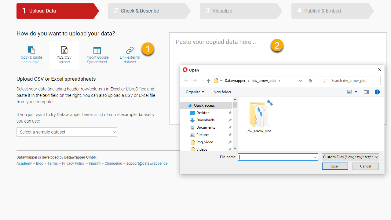
Getting the data
The first step is getting the data. After importing it using options in (1), you should see it in the text box (2). My experience tells me that it’s easier to import the data from a spreadsheet (no need for messing with delimiters, for example). When you have multiple sheets, you can choose one from a dropdown.
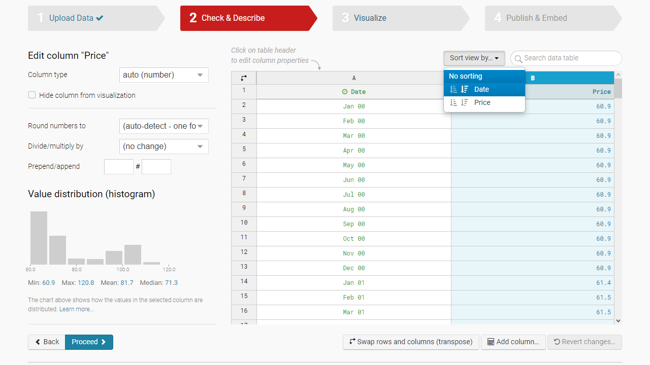
Check & Describe the data
This tab allows you to check if Datawrapper imported the data correctly and the right column type applied. Select each column header and see if anything unexpected pops out from the histogram. Ideally, the data should be oven-ready, but you can make minimal changes, like sorting or rounding. You can also add a calculated column.
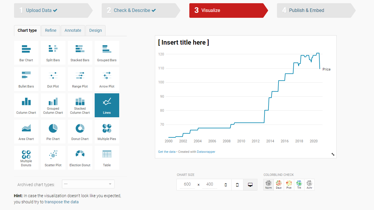
Visualize: Select chart type
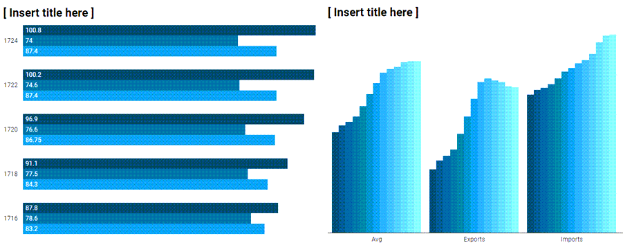
You have the option to select from a list of 19 chart types and a table. If you’re like me, your first reaction is to say that there are fewer than 19 chart types because bar charts are bar charts, no matter if they are horizontal or vertical. Well, I think that makes more sense in Excel or PowerBI, not in Datawrapper or similar tools. Also (and this is fascinating for an old Excel user like me), some differences go beyond bar direction. For example, if you have two or more series by year, Datawrapper will group bars by year, but it will group columns by series:
This option also allows you to test chart size and color blindness, but you should probably do that later, after choosing colors and adding other elements (annotation, etc.).
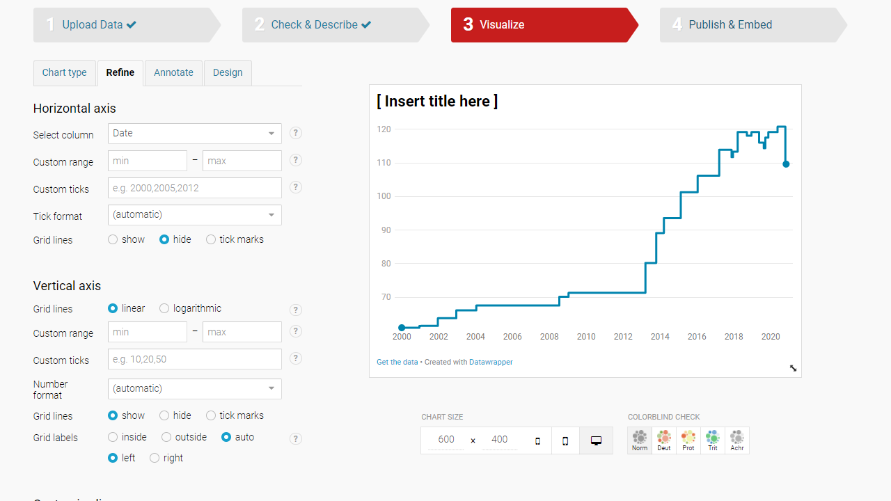
Visualize: Refine
This tab is where much of the action takes place. Most options are chart-specific, but choosing colors and adjusting x and y axes are the most common. I love being able to overwrite the automatic gridlines (I prefer fewer and not necessarily evenly spaced.)
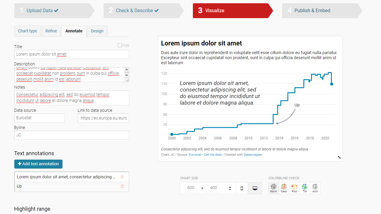
Visualize: Annotate
The more you learn about data visualization, the more you understand the need for highlighting and annotating. Your audience may not know what a pattern means or how good/bad a deviation to a reference line is. Datawrapper gives you plenty of options to add text, highlight horizontal or vertical ranges, or include reference lines. Instead of a short subtitle, you can write a whole paragraph. The footnote can also have a byline and a link to the data source.
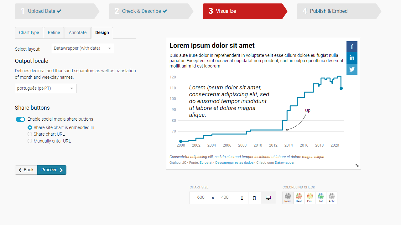
Visualize: Design
This last step under Visualize lets you choose a layout, define some regional settings, and enable share buttons (Facebook, Linkedin, and Twiter).
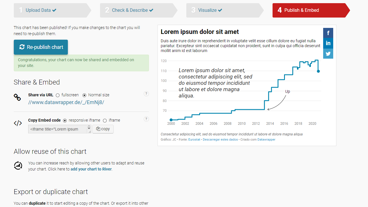
Publish & Embed
In this step, you generate a code to share or embed your chart on a page.
Aspect ratio
Make sure you adjust the chart aspect ratio before publishing it. The plot area of scatterplots and population pyramids tends to have an aspect ratio close to 1:1. In contrast, for bar and line charts, a ratio around the golden ratio (1:1.6) is usually a good starting point. Note that you can easily adjust width and height when using the iframe code, as you can see below.
<iframe title="Lorem ipsum dolor sit amet" aria-label="chart" id="datawrapper-chart-fs4PO" src="https://datawrapper.dwcdn.net/fs4PO/4/" scrolling="no" frameborder="0" style="border: none;" width="580" height="641"></iframe>
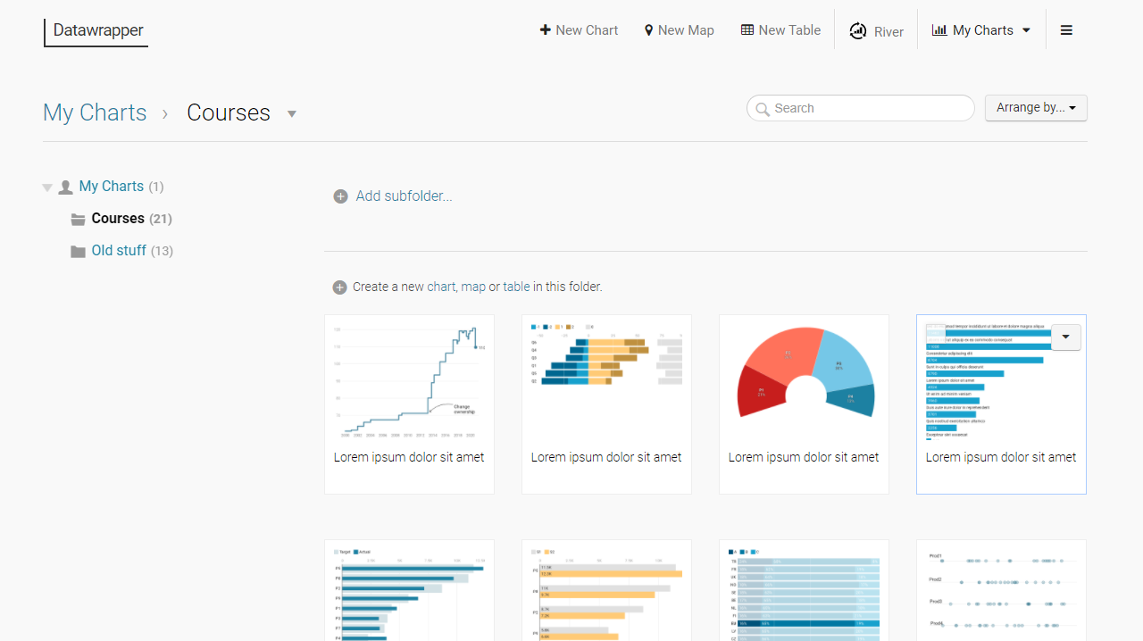
Chart collections
Datawrapper allows you to organize your charts in subfolders. Use them to create chart collections that make sense for your workflow. Don’t forget that since you can duplicate a chart, you can build a library of templates, reducing work and maintaining consistency.
Conclusion
Not only does Datawrapper do exceptionally well what it’s set up to create, but you’ll also find little gems scattered all over the place that will delight your data visualization soul. And there is more than meets the eye. For example, you can use the notes to create buttons to add some interaction, like switching between regions or categories in a single chart, create more flexible reference lines, or a title serving as the legend. I’ll add here sections on these more advanced features.