William Playfair, please meet Excel
In this project, the goal was to demonstrate, replicating a 19th-century chart, that a chart does not have to show the application with which it was made. It also turned out to be a great way to improve skills in our favorite app.
Are you sure you can recognize a chart made in Excel? I thought so too. Then, I started playing with some historical milestones of data visualization, and now I’m not sure anymore.
Here I intended to recreate the original chart but without cheating. I had to:
- use a single chart (that is, without multiple overlapping charts);
- avoid shapes and clipart to represent data;
- abstain from using Photoshop.
Here is a recreation of William Playfair’s chart on the evolution of the price of wheat compared to monthly wages:

Compare it with the chart above. Some details could be improved (font type, number formats), but it turned out to be closer to the original than I expected. Excel doesn’t like to represent areas in front of columns, and that was the biggest challenge.
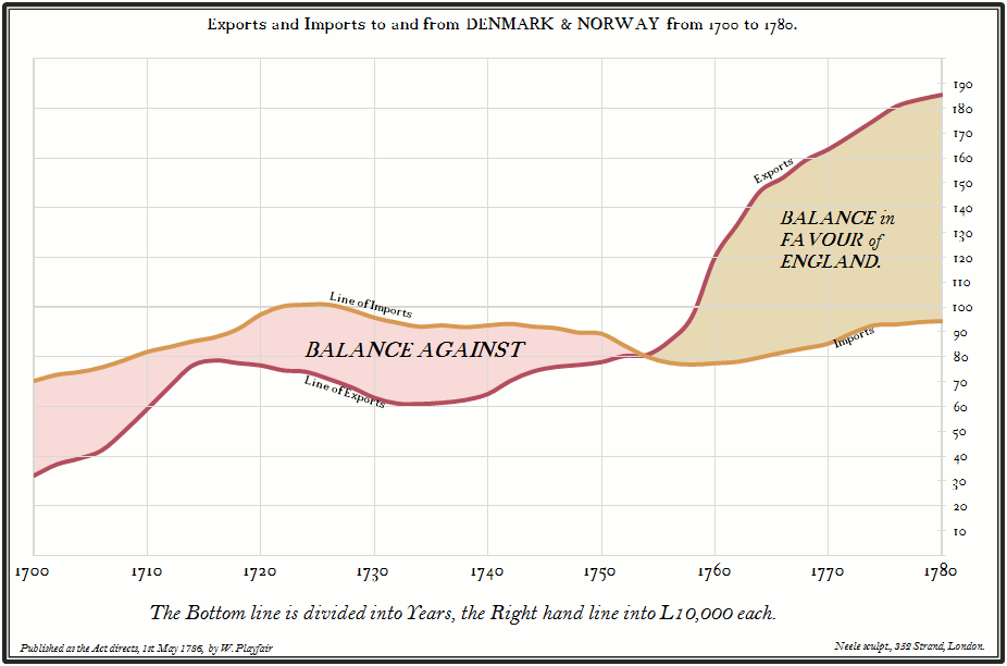
This Playfair chart was the second one I tried to recreate. I started with a simpler one, imports and exports from England::

Here is the original:

This exercise demonstrates that Excel has enough flexibility to create charts that do not look like Excel charts. You can create a chart that reflects your style, your sense of beauty, and how you want the data to be presented. It’s the old Excel, but they don’t need to know. It’s our secret, okay?
