Parts-of-a-whole: the fan chart
This is a small experiment to test the idea of comparing the proportions of multiple entities on something that looks like a pie chart. Keeping the idea of “whole” communicated by the circle, the chart displays multiple distributions.
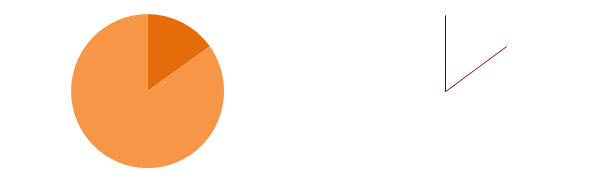
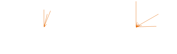
As you can see, an over-simplified pie chart can be reduced to an angle, leaving Gestalt laws to fill in the missing parts:
Same message, no fat. And because there are no textures or arcs, we can overlap a lot of pies. Below, these represent the proportions of people in the 65+ age group in 1996 (left) and 2050 (right) in 220 countries (US Census Bureau data). Each line indicates the proportion of this group in the total by country. For example, in 1996, the country with the largest proportion of people ages 65+ had about 20% in this age group. In 2050 many countries are well beyond that point, and there is a larger range of proportions.

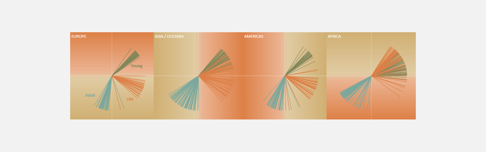
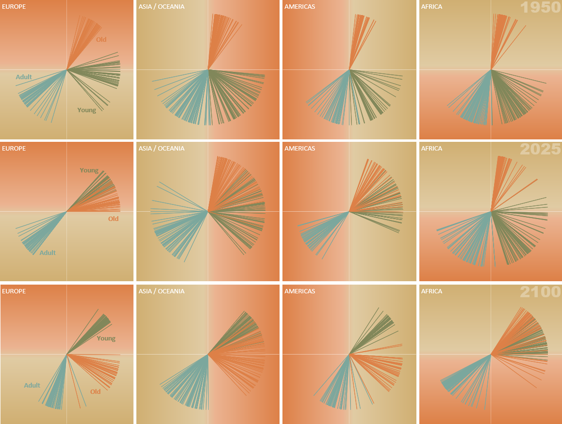
You can also see how age structures are changing in four areas of the globe. Note that, unlike pie charts, all slices start at the top:
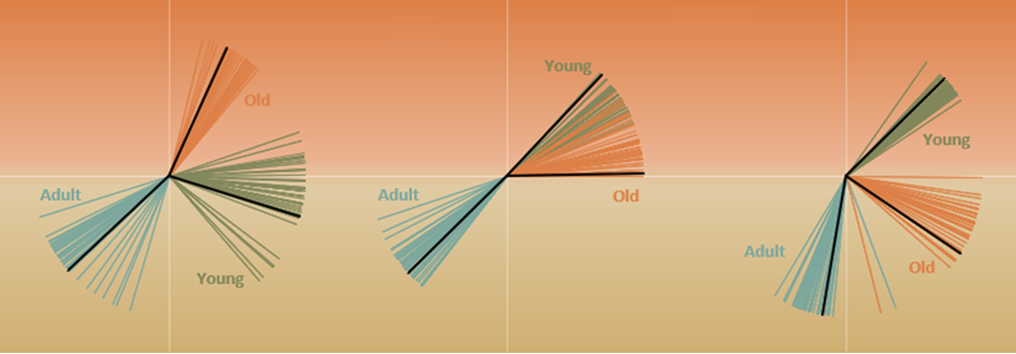
We can identify a single country (in this case, Portugal):
One of the problems with pie charts is that we can compare proportions but not the volume. In the image above, we are comparing countries of very different sizes (Tuvalu and China?). With the fan plot, we can use the line length to code the population volume.
I made these charts using a scatter plot, in Excel, in case you’re wondering. There are other, more effective ways to represent this data, of course, but this shows how we can explore new ways of doing this that go beyond the chart library. At the same time, it poses challenges that improve skills, both in data visualization and in the use of the tool.