
Data visualization tutorials
Summary
— This is a growing library of short video tutorials showing how to make standard charts using several popular point & click tools.
— This is a work-in-progress. Please read below the goals, what the roadmap looks like, and how you can help.
— Access to most videos is free for the time being.
How it works
— Use the left sidebar to navigate the collection.
— If you’re new to the site, you should start with the intro page for each tool.
— Read an explanation about each type of question a chart can answer, and discover all the available tutorials that answer that question.
If you’re new to the tutorials, I invite you to read the intro page for the tool that interests you (1), which gives you an overview of how to make a chart using that specific tool. The videos are grouped primarily by the type of question (proportions, change over time, etc.), so you should choose one of those groups in (2). You’ll get not only a collection of all available videos but also useful notes about these charts and how to design them. If you want to see which ones are available by tool, choose (3). [coming soon].
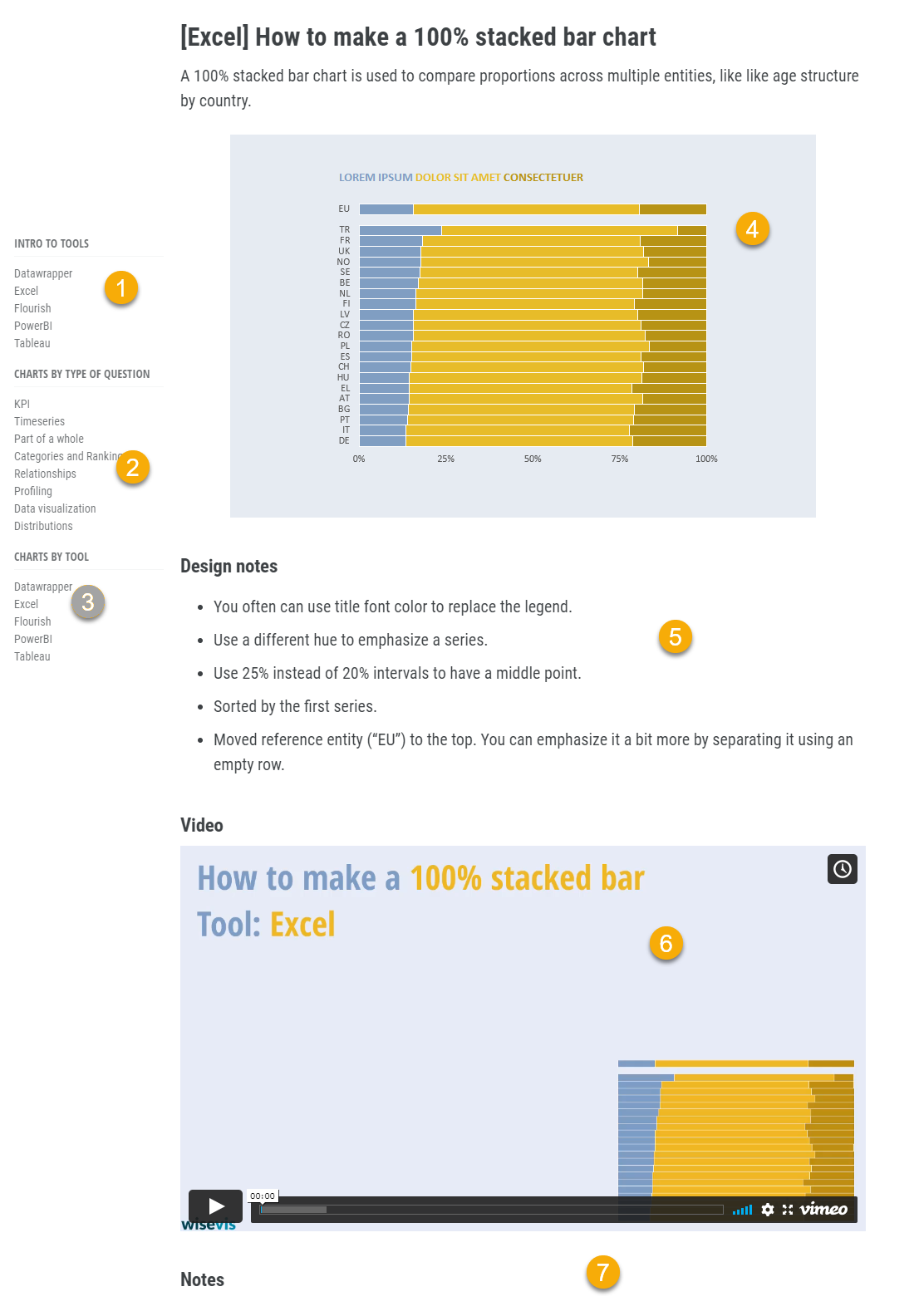
The page for each chart includes the chart itself, embedded or as an image (4), Design notes (5) for that specific chart that complements the notes in (2). The Video in (6) shows you how to make the chart. If I think some things need to be clarified, I’ll add a comment to the section Notes, below (7). I’ll add more notes based on your feedback, if necessary.
Tools
— Keep in mind that data visualization skills are transferable skills.
— There are dozens of tutorials for Excel, Datawrapper and Tableau already available, and I’ll be adding PowerBI, and Flourish.
— Be curious about how each tool implements a chart.
Data visualization skills are transferable skills. Apply them to whichever tool you choose, from pen & paper to a point and click tool, to a programming language. Each tool implements the chart differently, and you must adapt, but the underlying ideas don’t change. Since there aren’t many types of questions you answer with a chart (proportions, change over time, rankings), making a few dozen of them should be enough for you to master the tool’s basic chart-making mechanics.
Excel is my primary tool for making charts. It will be overrepresented in the library for a while. I’m trying to make sense of PowerBI from a data visualization perspective and get the most out of its flimsy core visuals. Creating charts in Tableau is so easy (the basic ones at least) that the average video length is likely to be much shorter than the Excel and PowerBI ones. There will also be tutorials for online tools, like Flourish and Datawrapper, two great tools with very sensible data visualization approaches.
Don’t ignore the tools that are not relevant to you. Take a look at how different tools implements the concept from a data visualization point of view. Some tools let you group slices in a pie chart, some tools force you to color-encode dozens of series one by one, while others have some automation, and the list could go on and on. When you switch from a tool to the next, I’m sure you’ll learn something new about data visualization.
Using the videos
— The video tutorials are short: a chart can’t take more than 3-5 min. to make.
— There is no narration, but explanatory notes are available.
—Subtitles will be added to all videos, starting with English and Portuguese.
— The tutorials use non-descriptive data, but real-world examples will show how to use the chart.
These videos are short (3-5 min.) and show all the steps to make the chart. Most charts use nondescriptive data that you can replicate using a random number generator. I suggest you watch the entire video once, get similar data, and reproduce the chart, slowing down and pausing the video when necessary. A blue ring means a left-click, and a red one is a right-click. Take advantage of the notes (if any) below the video to clarify issues you may have. DM me via Twitter with your questions, and I’ll answer them using the notes.
My priority goes to adding videos at a fast pace to cover the basics for most of the chosen tools. Adding narration is not a priority, but I’ll include these notes in the subtitles (the goal is to offer subtitles in multiple languages).
The last section on each page is a real-world example using the chart type and the tool (this is an example, and I’ll be adding more).
Current and next steps
— Expand and improve the library.
— Add theoretical tutorials to provide context.
— Increase complexity.
- My first goal was to record around 50 video tutorials for Excel, using techniques like combination charts, dummy data, error bars, and formatting options. This goal not only covers Excel but also creates a reference to make charts using other tools.
- The second goal is to make at least a couple dozen charts using each of the other tools. Some will be identical, others not so much: it will be interesting to compare how each application implements each chart type.
- Then I’ll get back to each video, add closed captions and real world examples.
Much of what comes next depends on your feedback. My current options are:
- Add more tools.
- Add more, and more complex charts.
- Create real-world multi-chart visualizations.
- Discuss data preparation.
Access to the collection
— Access to most of the collection will be free for a few weeks.
— Have a flexible access (a pay-as-you-go model) and create services around it.
- Free: While I expand it, work on the details and make the necessary changes based on your feedback, access to the whole collection of how-to videos will be free.
- Pay-as-you-go: During the second quarter, some courses will be available on a pay-as-you-go basis (no membership required).
- White-label: Want to add how-to videos to your internal training? Get the white-label version (your logo, custom first and last slides, watch from your domain). Contact us for details.
- Training & Consulting: If you hire me for consulting or training, all participants can get free access to the collection, so that a training session is more focused on higher-level training than the how-to part.